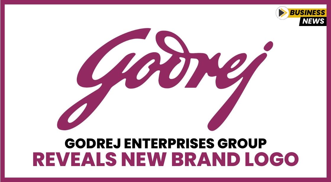
Godrej Enterprises Group Reveals New Brand Logo

News Synopsis
The Godrej Enterprises Group (GEG) introduced its refreshed brand identity on Thursday, marking a significant transformation aimed at strengthening its connection with customers and stakeholders. This new logo is a strategic move to unlock "new worlds" and create greater synergy across its diverse business ventures.
A Shift to Simplified Branding: Embracing Consistency
The most noticeable change in the revamped logo is the shift from a three-color palette to a single color. According to the company, this simplification is intended to offer a more consistent and unified identity that reflects greater harmony across the businesses within the group. By streamlining its visual identity, Godrej Enterprises aims to create a more cohesive brand presence that resonates with its customers and partners.
A Dynamic, Purple Colour Symbolizing Growth
The newly introduced purple color in the brand’s logo reflects a sense of dynamism and confidence. The company stated that this color is a symbol of its ambition to lead with sustainable, design-led innovation and engineering excellence. Retaining the cursive logo, which is reminiscent of the signature of Godrej founder Pirojsha Godrej, the refreshed logo represents the group's long-standing heritage while signaling a forward-thinking, progressive approach to meeting future challenges.
Focus on Reinvention and Customer-Centric Solutions
Jamshyd Godrej, Chairman and Managing Director of Godrej Enterprises Group, explained that the company’s growth has been closely tied to its ability to adapt to India’s evolving development needs. The brand refresh reflects Godrej’s commitment to continual reinvention, ensuring the company remains relevant in an ever-changing market. "Our aspiration is to unlock greater value for customers by delivering solutions and experiences that positively impact lives," Godrej said. The new logo and brand identity are designed to meet customer aspirations while staying rooted in the company’s tradition of quality and engineering excellence.
Balancing Innovation with Tradition: A Look at the Brand’s Evolution
Nyrika Holkar, Executive Director at Godrej Enterprises Group, emphasized that the refreshed identity is more than just a cosmetic change. It embodies the company’s commitment to authenticity and its drive to redefine consumer experiences. As the company shifts towards more premium offerings in its “Consumer First” businesses, it also aims to provide cutting-edge engineering solutions in its “Nation First” businesses. These changes reflect the growing sophistication of customer expectations and the company’s vision of showcasing India’s engineering excellence on a global stage.
A Look at the Group’s Legacy and Future Prospects
The Godrej Enterprises Group, which includes Godrej & Boyce, Godrej Holdings, and Godrej Infotech, has a rich legacy spanning over 120 years. Since its founding in 1897, the group has been at the forefront of India’s economic development. It has pioneered innovations like the world’s first patented springless lock and safes, as well as Indian-made typewriters and refrigerators. Today, the group has expanded its presence across five continents, leading key sectors such as aerospace, energy, and security, and continues to play an integral role in nation-building.
The Godrej Enterprises Group remains committed to creating lasting value in both consumer-facing and nation-building sectors. Its diverse portfolio includes businesses in aerospace, aviation, defense, energy solutions, locks & security, advanced engineering, real estate, intralogistics, consumer durables, furniture, and information technology.
You May Like


