Minimal UI Design is the Future- Know More
Blog Post
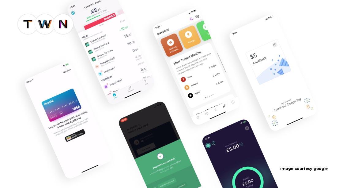
Minimalism entails removing excess and strategically arranging the remaining elements. It is focused on the specific use of space in which colors are typically balanced, and small components occupy large spaces. As a result, you may end up with a simple but powerful design that is simplified to deliver your message. Minimalism can be observed in all art forms, from architectural style to graphic design to fashion, and has lately proven to be extremely useful in interface design. This article is about minimalist UI design trends that are ruling the design world. #TWN
I became a fan of the Modern Minimal since the day I saw the Design of a Webpage from Apple. To add more to my curiosity came the webpage of Spline, a 3D modeling tool. These minimal UI Designs are setting trends, and if you are a UX designer in 2022, then you have to look at these trends and incorporate them into your projects.
They are just amazing, I tell you!
Minimalism entails removing excess and strategically arranging the remaining elements. It is focused on the specific use of space in which colors are typically balanced, and small components occupy large spaces. As a result, you may end up with a simple but powerful design that is simplified to deliver your message. Minimalism can be observed in all art forms, from architectural style to graphic design to fashion, and has lately proven to be extremely useful in interface design.
Although minimalist UI design seeks simplicity and reduction in order to eradicate all symbolic allusions and concentrate the gaze on more crucial matters such as color, scale, volume, or the area surrounding, selecting what we choose in work is not as simple as we would like, especially when we consider the functionalism aspect.
There was nothing like this before, and I feel like I've been waiting for a fresh, operational, and visually striking design style to arise for a long time. And it completely stole my heart.
I've noticed similar layout design structures in a variety of interfaces. These interfaces looked fantastic — they were eye-catching and comprehensible while remaining friendly and understated. They struck me as the ideal compromise between being visually appealing and functional.
Minimalism UI Design’s Characteristics
The following are some of the main characteristics of minimalism that designers frequently mention:
- Simplicity
- Clarity
- A visual hierarchy that expresses
- Proportions and composition are given special consideration.
- Every element's functionality
- A large amount of free space High attention to detail ratio
- Typography is a key design element
- Getting rid of non-functional decorative elements
Let’s talk about some latest minimalist UI design trends of 2022.
Latest Minimalist UI Design Trends
-
Whitespace & Bright backgrounds
Whitespace is king in modern minimalism. The entire interface's content is frequently displayed on a white or very bright background. The deliberate use of whitespace helps make the interface appear clean, fresh, and aesthetically appealing in general. Minimal UI designs with whitespace look like they came from the future.
-
Subtle Roundness around UI elements
In the Modern Minimal style, the UI elements are subtly rounded. It gives the interface a more organic and pleasant appearance. If you're familiar with the latest craze known as Clubhouse, you're likely familiar with their rounded animated characters. They make the entire product appear more unique and distinct!
And who on earth doesn’t like the rounded corners?
Personally, I prefer rounded edges (they are more pleasurable contrary to the sharp ones). The trick is to limit the use of roundness to specific elements such as buttons and containers. The radius of the corners must not exceed certain values (slightly rounded is preferable to fully rounded — this law does not apply to fully rounded buttons).
-
Big Headings, Readable Headings
I adore those big, bold headings! They are also improving the interface's appearance. You can use either sans-serif or serif fonts, but I recommend sticking to geometric sans-serifs like Gilroy, Sofia Pro, Lufga, or Circular. Konnect, Geliat, Galano, Pulp, Gordita, Visby, and +Jakarta Sans are other options.
Minimalist UI design with a big, bold heading is among the latest UI design trends, and it is here to stay for a long time.
-
Real-life Photography
Yes! Real-life photography is embraced by Modern Minimal.
Earlier, I predicted the return of real-life photos. It was bound to happen — everyone is growing tired of the childlike 3D renders, flat folks, and hand-drawn scribbles. Real-life photos have one significant advantage: they simply appear "real," adding a sense of reality to digital goods. My own research studies show that users enjoy photos to illustrations because they appear more serious and emotionally connected to real-life experiences.
-
Use of Colors, Thoughtfully
Colors in modern minimalist style are frequently kept to a minimum. They are typically used to highlight the main actions and/or elements.
Because of this, the interface is pleasing to the eye, as no large splashes of color scream for the user's attention all the time.
-
Sole Focus on Contrast
One advantage of Modern Minimal UI Design is its ease of use. With enough contrast, we can easily distinguish the background from the components, understand the visuals, and navigate the interface.
-
Use of Effects, but in Limit
Modern Minimalist UI design takes inspiration from a wide range of styles and effects. To a certain extent, subtle colorful shadows, muddled aurora backgrounds, embosses, or even glassmorphic components are welcome. As a result, the interface remains comprehensible and visually clutter-free.
-
Illustrated Small Details
The detailing is also something I appreciate about Modern Minimal. Despite its minimalistic appearance, it accepts nice small elements like icons, emoticons, and other visual elements like patterns and collages that combine real-life photos with drawings. The use of graphical elements that we are all familiar with makes the UI more welcoming and enjoyable.


